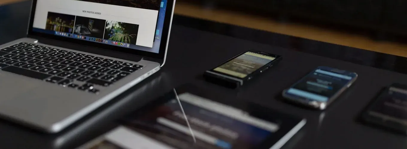
Your customers use whatever's in their hand: a phone, a tablet, a laptop. Your website has to work on all of them.
That's responsive web design in a sentence.
What it means
A responsive site adjusts to the screen it's on. The layout, images and text rearrange themselves, so a visitor on a phone gets something readable and easy to tap, not a shrunken desktop page they have to pinch and squint at.

Why it's worth it
- Happier visitors. When it works on their device, people stay and look around. That's where calls come from.
- Better for search. Google recommends responsive design, and it primarily uses the mobile version of your site when it ranks you. A site that works on a phone is easier to find.
- Fewer people leaving. If a page is hard to read or tap, people leave. Responsive pages hold on to more of them.
- Less to maintain. One site, not three. A change you make shows up everywhere, so you pay to update it once.
Why it matters now
Most people look you up on their phone. For a local business, that's often someone in a hurry who needs to call. If your site fumbles that moment, they call the next result. We build every website with the phone in mind from the first sketch, and our Baton Rouge design tips cover the rest.

The short version
If your site isn't comfortable to use on a phone, it's costing you customers. Check yours today. Better yet, see where it stands with the free audit, or talk to us. A solid navigation setup helps too.

Keegan has built 140+ websites since 2015. Today he builds websites and local search systems that get home service businesses more calls.
More about Keegan